…sharing some drawings and notes from a whiteboard training today.
Excuse spelling… its been a long day in the trenches!
The topic was useful artifacts and visualizations (for PMs, product development teams, etc.)
As a PM you are always shifting context.
- Timeframe. From today until two years from now
- Audience. From developers to CEOs
- Scope. From big picture strategy to tactical details
- Level of Certainty. From vague guesses to hard facts
- Activity. Making decisions, understanding status, providing necessary context, researching, facilitating meetings, [and about 100 other things] Whenever you’re thinking high level, someone will bring you down to earth and ask you to get into the weeds. Whenever you’re in the weeds, someone will complain that you’re not being high level enough. It’s the burden we bear. Just when you think you’ve figured things out, you’ll encounter a person who needs to see your roadmap, or backlog, or “sprint backlog”, or “project”, or “plan” in a whole new way.
So…changing delivery based on context is important. You could argue that it is the biggest challenge facing PMs. It is a design problem!
I’d like to share a couple that work for me. There are more, but these are some of my go-tos.
Note: Very importantly. These drawings are very, very purposefully rough. Don’t read too much into the words I use. I’m not in love with the word Epic, for example.
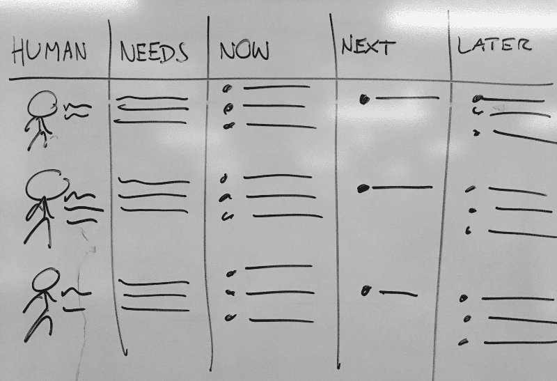
1. One page roadmap
Good for…
- Connecting work to humans and their needs
- Detailed idea of what is happening now
- Sense of what is happening next (but more high level)
- Clearly saying that some stuff will happen “later”
- Great backdrop for chatting about the now, and the next couple quarters
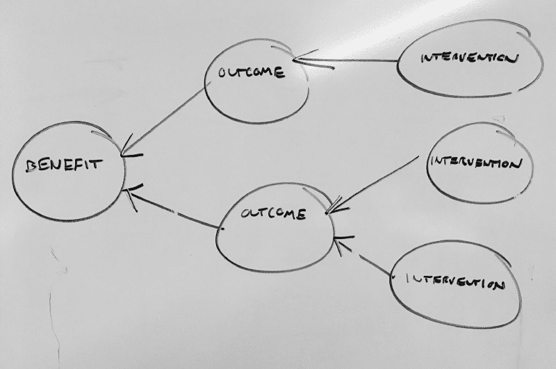
2. Benefits map
Good for…
- Mapping your work to expected outcomes and benefits
- Facilitating discussions about causation and correlation
- Understanding the Why behind your current work
- Metrics brainstorming (“how will we measure the outcome”)
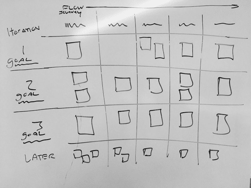
3. User story map
Good for…
- As a reminder to deliver horizontal slices across the problem space
- To facilitate release planning, prioritization, and scoping
- To keep the user journey/workflow/goal front stage
- To see how the experience will evolve over time
- PS: In my dream world, someone would make a user story map that could also be re-visualized as a kanban board. I think they’re probably the best all around tool for triggering conversations
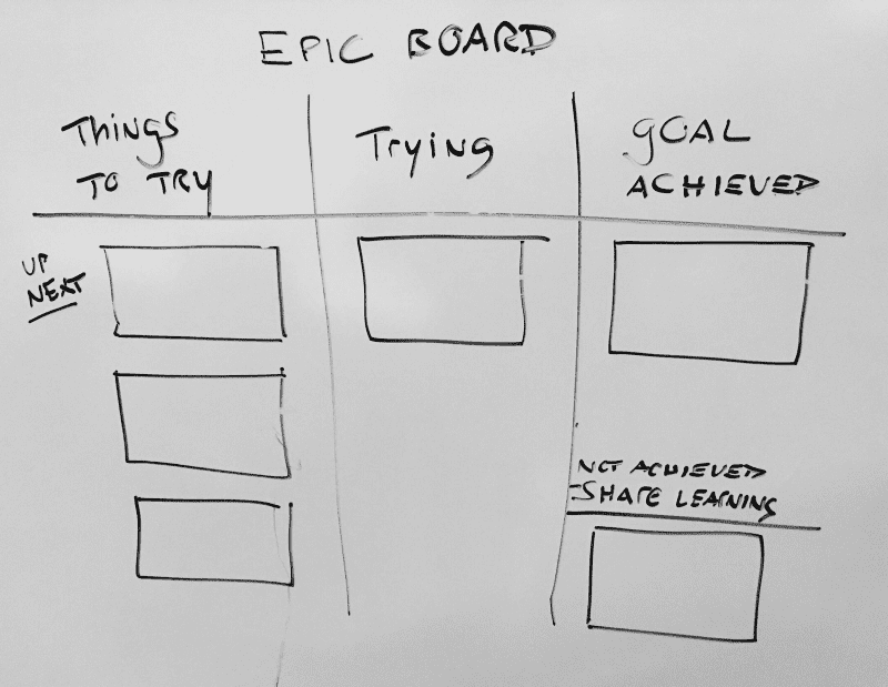
4. Epic board
Good for…
- Going a level above user stories
- Prioritization discussions
- Coarse-level backlog grooming
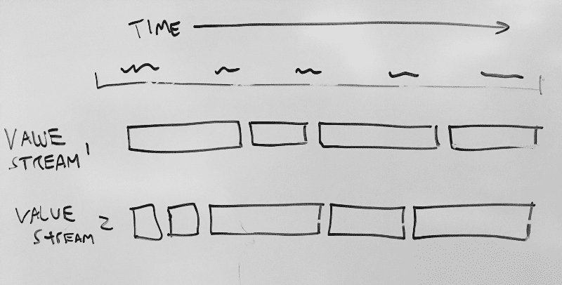
5. Timeline
Good for…
- Seeing a linear progression of planned work
- Communicating to people who think in terms of time/calendars
- See how a particular value stream will evolve over time
- Warning: I prefer not to see actual dates in the timeline. One trick is to obscure the timeline with a large “this month”, and smaller subsequent months … perhaps even keeping 6–12 months as a single block
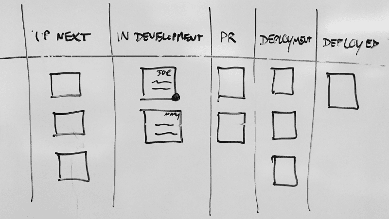
6. “Standup” Board
Good for…
- A centerpiece for day-to-day stand-ups
- What is being worked on right now?
- Resolving blockers and dependencies
- Knowing what is in PR review, staging, prod, etc.
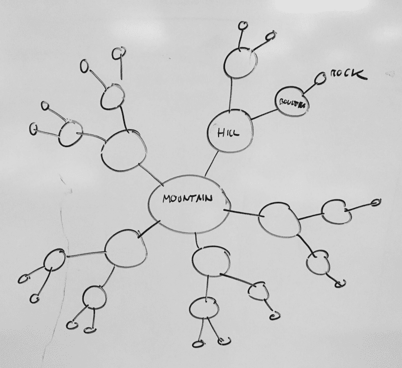
7. Mind map with horizons
Good for…
- Understanding planning horizons. Mountains rarely move, and rocks can be thrown over cliffs
- Connecting work items to the central beliefs/assumptions of the organization
- Reinforcing that tactics/experiments may change, but the Why remains
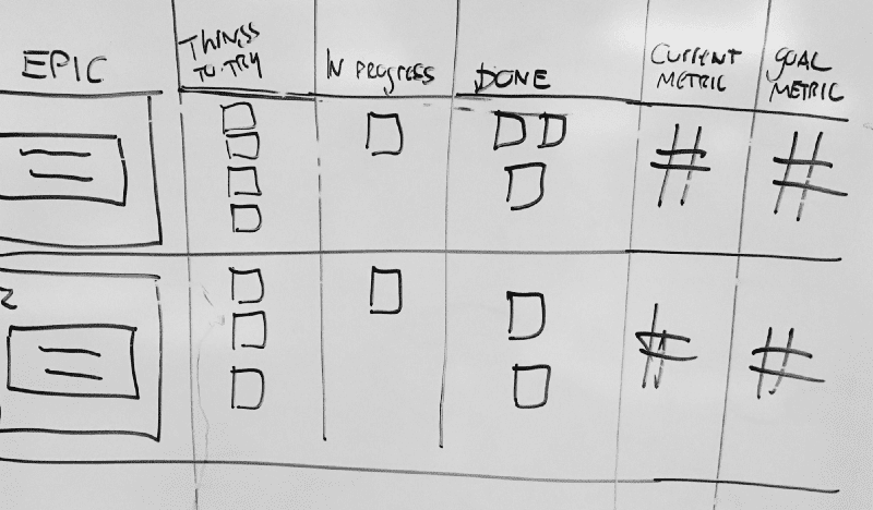
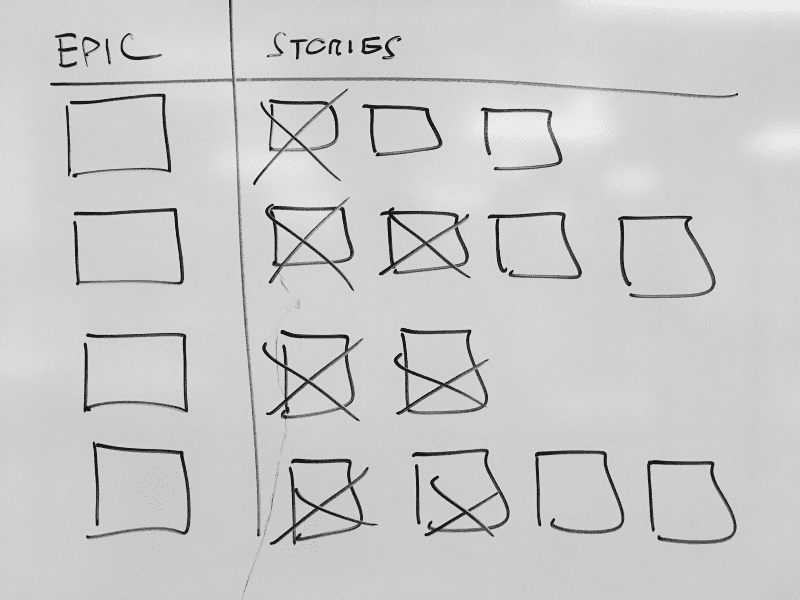
8. Combined Epic/Story board
Good for…
- Attempting to reiterate the goal. Why are we writing these stories?
- Situations where you are “moving a metric”, and that the team will continue until you hit that metric
- Trying to merge the “bigger picture” with day-to-day activities
9. Big visual checklist
Good for…
- A sense of accomplishment (“checking things off list”)
- Planning and brainstorming
- Sometimes, success is truly about ripping through stories (not often, in my book)
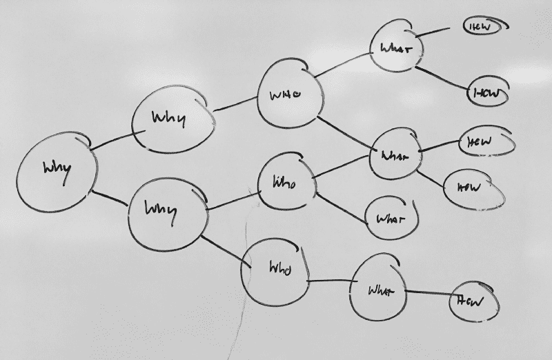
10. Impact map.
Good for…
- Similar to the benefits map
- Importantly, includes the Who
- Can be a better option when words like “Outcome” and “Intervention” scare people away
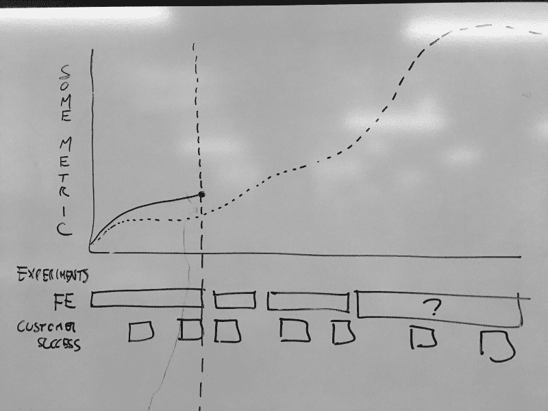
11. Experiment timeline
Good for…
- Showing how work is mapping to our efforts to move a metric
- Showing the forecast (and the baseline)
- Plotting our progress
- Importantly, this is not velocity of work or a burn-down
